The Wizarding World is Warner Bros.’ companion app uniting the Harry Potter universe
Warner Bros.’ companion app for the Harry Potter franchise — a single place that unifies every sub-brand into one HP universe: movies, games, quizzes, video trailers and much more.
I led the UX, the design system and the mobile interaction at Huge, bridging the gap between the dev team and the creative directors, and tested through seven research rounds before hand-off.
ResultsOutcomes
What the work delivered, in plain terms — the global rollout is real and already public.
Seven rounds of testing before anything went to build.
A single component system held the full range of card types across every audience segment.
Launched Oct 2019 in UK, US, Ireland, Canada, Australia & NZ, then rolled out to 20+ countries across Europe, South Africa, Brazil and Mexico.
A Pottermore × Warner Bros. joint venture — AR Sorting Ceremony as the flagship feature, Wizarding World Gold as the paid annual subscription.
Registration completion improved across prototype rounds 1 to 7.
Blink · the whole case in seven bulletsIf you only have 40 seconds
- 2018 — led UX, the design system and mobile motion at Huge for Warner Bros’ The Wizarding World: one companion app uniting the whole Harry Potter universe (films, games, quizzes, trailers).
- Bridged dev and creative directors; built in React with Lottie, video renders and parallax to pull off “magical” smoke, glitter and sparkle interactions in a grid-first framework.
- Core concept: bite-size content as a card feed — cards and weekly “packs” (magazine meets daily drop) to build a checking habit, with endless drill-down that always returns home, plus haptics and swipe/hold gestures.
- Designed a COPPA flow for US under-13s — request and email parental consent, register with no data stored — later approved by Warner Bros’ legal; modular sections show/hide by permission.
- Built login, onboarding and registration as a combined UX + visual + motion piece (animated date/email inputs, a spoiler-preventing “what have you seen/read” selection).
- Designed a Benefits Vault of stateful cards — Weekly Drops (sneaker-style), Coming Soon (countdown/hype), Claimed, Expiring Soon (a card that literally creeps away), Expired — plus in-app e-commerce for merch.
- 7+ testing rounds (roughly monthly), parallax canvas and lazy loading for performance, a web UX workshop, and a demo prototype presented to J.K. Rowling; launched on iOS & Android.
Glance · 01One app for the whole HP universe
The Wizarding World is Warner Bros’ companion app unifying every Harry Potter sub-brand — films, games, quizzes, trailers — into one go-to place. I led UX, the design system and motion at Huge, acting as the user and tech advocate between developers and creative directors, with the whole thing built in React and animated via Lottie, video and parallax.
Glance · 02Content as a card feed
Rather than traditional navigation, content arrives in bite-size cards and packs, feed-style. Content testing settled on a blend of a weekly “magazine” pack and single daily drops to capture attention and build a habit; the feed reshuffles each open, older packs sink to the bottom, and users can dive endlessly into related cards but always return home — with haptics and swipe/tap-hold gestures.
Glance · 03Compliance & onboarding
For a franchise spanning adults, kids and parents, US under-13s needed a COPPA flow — request and grant parental permission by email, register with no data stored (later signed off by WB’s legal), with modular sections shown or hidden by permission. Login and onboarding fused UX, visual and motion: animated date and email inputs, and a spoiler-aware selection of the books, films and plays you’ve seen.
Glance · 04The Benefits Vault
Membership benefits became a Vault of stateful cards rather than a flat grid. Date-driven events pin to the top; Weekly Drops borrow the sneaker world’s limited-release pattern; Coming Soon builds hype with a countdown; Claimed, Expiring Soon (a card that visibly creeps away) and greyed-out Expired cards show what you might miss — all built to vary by location for a global launch.
Glance · 05Testing, performance & commerce
The product was pressure-tested across 7+ research rounds (roughly one a sprint), scoring each section pass/miss to pivot dynamically. Performance leaned on a parallax canvas (images moving on scroll instead of video) and lazy loading for content-heavy pages. We also designed in-app e-commerce for the franchise’s huge merch catalogue, and a demo was presented to J.K. Rowling before launch on iOS and Android.
OverviewOverview
For almost all of 2018 I worked on an app for Warner Brothers’ Harry Potter franchise called The Wizarding World. An app that would unify all subbrands and be like an HP universe, a go-to place to find info about your movies, games, quizzes, video trailers and much more.
This came like a really cool story because I hadn’t read or seen any Harry Potter book or movie and surprisingly all my colleagues were quite fans of it. This was soon to change, but in the first stage, I think this was quite cool as it balanced out the team. I was more of a user and tech advocate, bridging the gap between the dev team and the creative directors.
We used React to build the whole app and this brought some interesting solutions for how to create ‘magical’ interactions like smoke, glitter, sparkles within a framework that is mainly used for fast grid-like content (for example the Instagram app is built in React Native). We used Airbnb’s Lottie plugin a lot, combined with video renders along with parallax libraries.

I’ve joined the team at Huge just after the discovery phase, when we decided that we have in scope an app, as opposed to a web portal (as the Star Wars franchise has).
My work included a demo prototype presented to J.K. Rowling:
01 — ConceptConcept
The app mechanics are a way to digest content in small ‘bite-size’ pieces. It works as a feed, similar to what Facebook, Twitter and Instagram deliver to their users. This was great because it has some real advantages over traditional navigation, as you can tailor the experience to each user group.
The content is pushed to the users in the form of cards and packs of cards. We content tested with multiple ways of doing this and how the audience will perceive packs with a weekly structure (similar to a magazine) versus single daily drops. We came to the result that a combination of these two will be great to capture attention and enrol users to create a habit in checking the app.
Cards come in packs or individual items and the user will always see a different feed when the app is opened up. When a previous pack is outdated by a new pack it will be positioned at the end of the current array of cards.


Side by side navigation of the prototype shows the different levels of content a user can go through. You can see related cards and dive endlessly deep into the structure, but can always come back to the starting point using the main navigation.

Cards have a haptic response, moving them left and right (swiping) will pull other cards with a slight delay while tap and hold brings out the respective card.


02 — ComplianceCoppa flow
The project itself was designed for a broad audience as the franchise covers adults, kids and parents on the same app. For the under 13’s in the US we were required to create a specific flow where their parents or supervisor would grant permission to use the app. In the example below, we created a way to request, grant permission (via email) and register under 13’s without any storage of their data. This was later sent and approved by a law consultant part of Warner Brothers group.
The app itself would feel and be structured the same as most of the section is modular and can be made invisible or visible according to the permissions.

03 — OnboardingLogin, Onboarding and Registration
Working on login brought a mix of UX, Visual Design and motion Interaction. Here is a video of the full (prototyped) experience and below is a breakdown of each feature and a bit of explanation.
Features

Load Screen
Once the page is loaded the logos and text appear gradually, they hold ±800ms and then the screen moves down to the day date input.

Date Input
Once touched, the input field will be auto-populated with the 01 number and the select prompt will pop up.
From here the selection is either synced or it auto-updates itself when the user selects a date from the selection prompt.

Email Input
The two markers on the side indicate the step and details of the input.
Back button gets us to the previous step. Additionally you can swipe up and down to go to the back and next fields.
Note: The blinking text cursor will disappear when fields are transitioning.

Show or hide password
Password comes as default hidden, if you are the only one using the device and feel comfortable, there is an option to show the text.

In the onboarding we created a selection flow in order to know our users more and tailor our content and prevent spoilers. In this example users can select what Books, Movies and Plays they’ve seen or read.
Benefits Vault
The benefit vault is the place where you could see your benefits as a member of the Wizarding World. As opposed to simple benefits listing grid, we had a couple of variables as some of them were date-driven (events), that will most likely be featured or pinned on top when you open the section.

We had a couple of variations beside ‘normal’ items, a few and what I think are the most interesting ones listed below:
Weekly Drops used a similar pattern used frequently in the sneaker industry for special or limited releases.
Coming Soon — Can be used on some but not all benefits in order to build up anticipation (aka hype). A CTA to be notified would be a nice-to-have. Can include a countdown until the product is launched.
Claimed — This means they have claimed it by doing the tap and hold but have not yet redeemed it. Could use same icon as we use in the ‘My Rewards’ button at the top of the main page?
Expiring Soon — Are benefit items that are about to go away. In order to emphasize this in visual terms we mocked up a benefit card that literally goes away, at least by a couple of pixels. We also experimented with a Niffler-like animation that will ‘steal’ or push the container aside.
Expired — Expired benefit cards would appear greyed out but still readable. With expired cards we wanted a way to show what users missed out and promote recurring events. Also bear in mind this app was about to launch globally, so we considered variations of content determined by location.


04 — ResearchUser Testing
In this project we had over 7 user testing rounds, roughly one per month — one every two sprints in order to test and help us pivot our product dynamically.
Here is a sample of our mid-October user testing round, showing the steps and process of our close-to-finished app:
October User Testing
For testing we created a key template in spreadsheets with our hypothesis in scope. Each section of the app has a cell allocated to see if a user would pass or miss each section. When the testing is over we can see a percentage score of each section from where we can then decide which areas we can improve.

05 — PrototypeItems we tested

Parallax Canvas
To reduce the size and avoid video files we created a mix of images that move position on scroll and transition up and down automatically. The aim is to reduce file size as well as to create a non-distracting environment where content pops out more.

Menu and Navigation
Navigation is based on tabs, each section should be treated as a separate workspace, once you tap another section and come back, you will end on the same place where you left.

Discover page / Indexes
Discovery is the go to place to see structured documented content.

Issue Archive
A section where you can see past issues of the magazine-like card packs.

Editorial Section

News

Quizzes
Quiz archive with a horizontal scroll filter method.

Lazy Loading
When a user scrolls to the end of the page some elements will start to load. This will save a lot of the loading speed on mobile as most of the pages are content-heavy.
Methodology

Findings
We each created notes and observations individually, after the tests we merged our findings in a Google Doc.


Aggregated findings in our monthly stakeholders presentation.

06 — WebWizzarding World Web
UX Workshop
Now I know every time is different, so it’s better to choose and improvise the best way to collab and spark creativity within your group. In this case we used the crazy 8’s workshop method in order to engage everybody from the team to draw their ideas on paper, present and then vote for the most interesting findings. Here are a couple of ideas that popped out:

Information Architecture

07 — CommerceEcomm
One of the big revenue streams for the Harry Potter franchise is merch. Their stores are always crowded and have an incredible taxonomy of items. We worked with a third party agency specialised in custom large eCommerce platforms.
The challenge was to work out the integration of the store in our app, navigation, product widgets, featured products, promotions, filters, on store collection flow, apple pay integration.


08 — R&DExperiments
Here is a selection of the many interactions prototypes we did in over a year of testing, some of them were included in the development roadmap later on, some are just to test all kind of wacky ideas that came out of a workshop session:


09 — In the pressPress coverage
Here are a couple of articles and youtubers reviewing the app. As in late 2019, it seems it’s launched on iOS and Android and includes most of the features in scope, with all updates to be pushed in early 2020 (to replace the Pottermore website). You can get the app for iOS here.
CreditsThanks to the HUGE & WB teams
It was a pleasant ride to spend time with you guys and shape up this project! There were so many cool and talented people around like Kieron Leppard, Angie Yuanmalai, Derek Fridman, Oliver De Cet, Tom Bloomfield, Ben Gonshaw, Anna Parellada, Giorgia Xia, Baptiste Dumas, Stephanie King among the rest of Huge London and New York teams!
Related projects
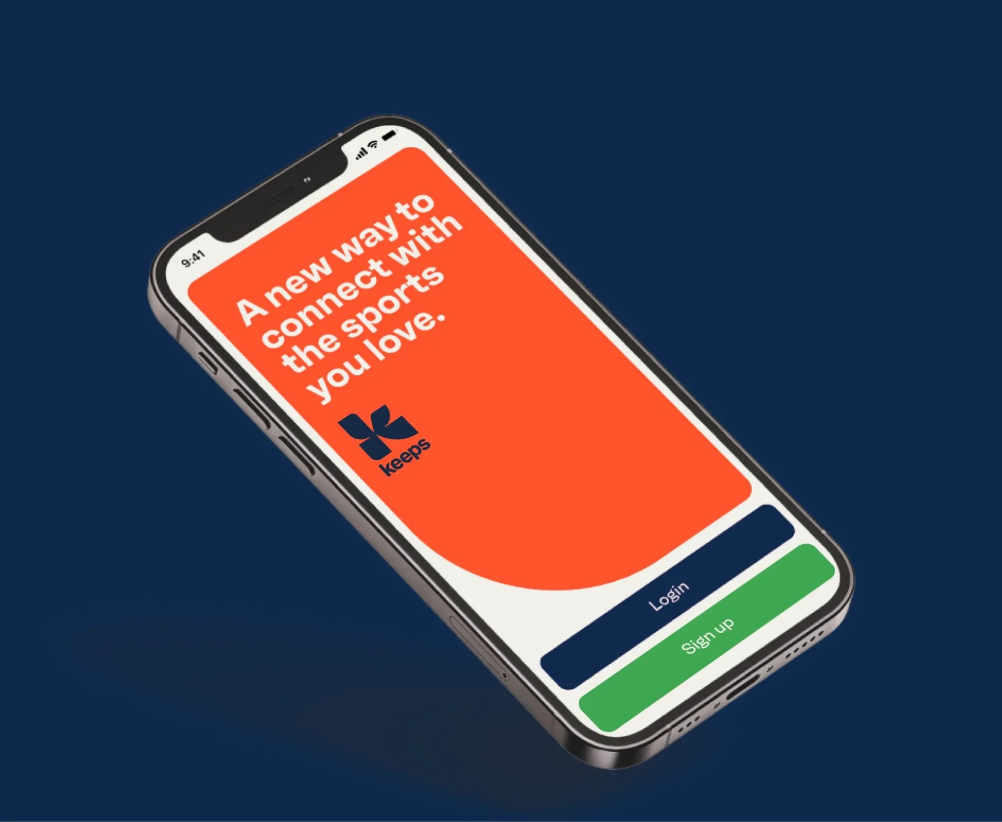
Sport-Investment Platform
UX and a scalable design system for buying, trading and cashing out stakes in sport.
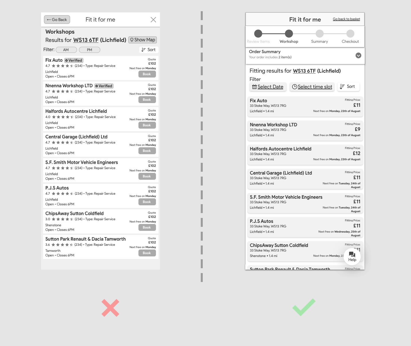
Fit it for me
Buy a part, then book a local approved workshop to fit it — straight from the basket.
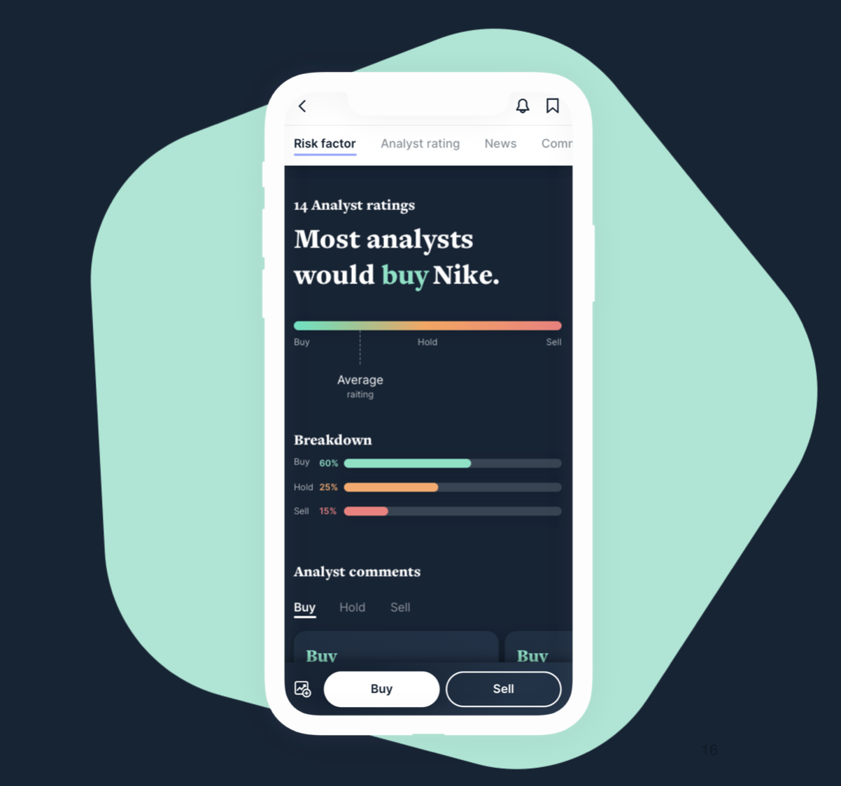
Future of Trading
Layering trading and wealth management onto Citi’s banking app — stocks, crypto, portfolios and advice.
EssilorLuxottica
Reworked checkout and account flows, localised across seven European markets.